
UX/UI Design · Collaboration.Ai · October 2023 🔗 TeamCreator

TeamCreator is a community connection tool that is designed for linking people from different organizations with the same data set results. It is used to leverage data to intelligently create and manage groups, making company networking more efficient, engaging, and effective.
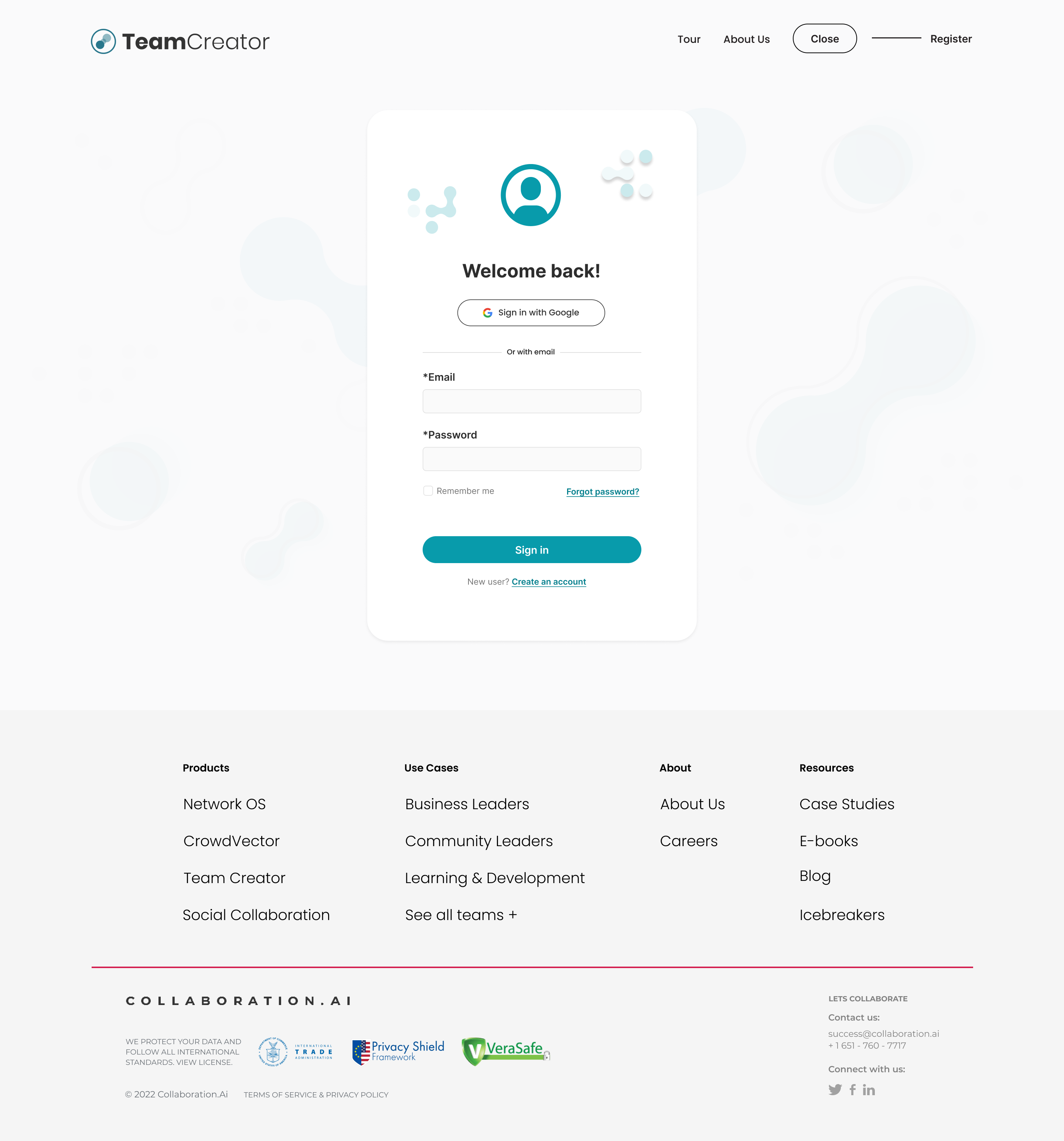
As the continuing designer, the focus of the project was to design a captivating landing page that would ultimately communicate the essence of company networking, create a product identity, and ensuring the seamless visual continuity of the remaining screens to be redesigned.
Continuing UX/UI Designer
October 2022 - January 2023


The landing page redesign focused on creating a specific yet consistent product image of the platform. This move paved way to follow the product’s brand guidelines, create text hierarchy, eliminate sections that were unnecessary based on the spefications and create a concise yet relevant idea of the product and its usage.


Organizations sometimes have to handle several events at the same time, making it confusing and difficult for users to keep track of event details and updates.
The redesigned event card features provide clarity and overview of details without needing to open the main event page. Users can quickly see key information such as event type, status, and overall progress at glance, improving efficient navigation and reducing cognitive load.


In TeamCreator, network grouping is determined by survey responses and individual data sets. However, the process of creating and managing survey questions can be challenging, particularly when the user interface is complex and unintuitive.
The redesign introduces a simpler and more intuitive approach to grouping questions based on their difficulty levels.
The creation of custom survey questions is made easier and user-friendly with the addition of a drag-and-drop feature for selecting question types. To further support user, sample questions are also provided as helpful references during survey question creation.


In the platform, users create event cards that include both survey questions and survey participants. However, when managing events with a large number of participants, it becomes important for users to easily track who has completed the survey and who hasn’t.
Address this need ensures better visibility and efficient follow-up during the event survey process.
The status icon in the table provides a clear visual indicator of each participant’s survey progress. This allows users to quickly identify who has or hasn’t responded, enabling timely follow-ups—such as sending reminders via LinkedIn messages for improved response rates.


Working within an established framework required adaptability—leveraging existing components while making strategic refinements to improve the overall design without disrupting the system.
The new interface of TeamCreator was focused on improving the user experience and making it an intuitive, and accessible product for the users and the different organizations
Integrating a pre-established design system while introducing fresh elements required a thoughtful balance. Maintaining brand consistency while enhancing the visual appeal was key to creating a cohesive experience.