Logo Design · Collaboration.Ai · September 2023 🔗 Collaboration.Ai
.gif)
Collaboration.Ai is a software development company in US that aims to harness untapped network and knowledge in order to enable intelligent collaboration, working with like-minded customers who are true co-innovators.. The company has 4 product softwares that takes unconventional approach that is powered by novel technologies and agile methods.
Handling 4 products, Collaboration.Ai wants to reimagine the company’s brand logo that would unite and represent its company’s core of “human network connection”.
Sole Brand Designer
September 2023
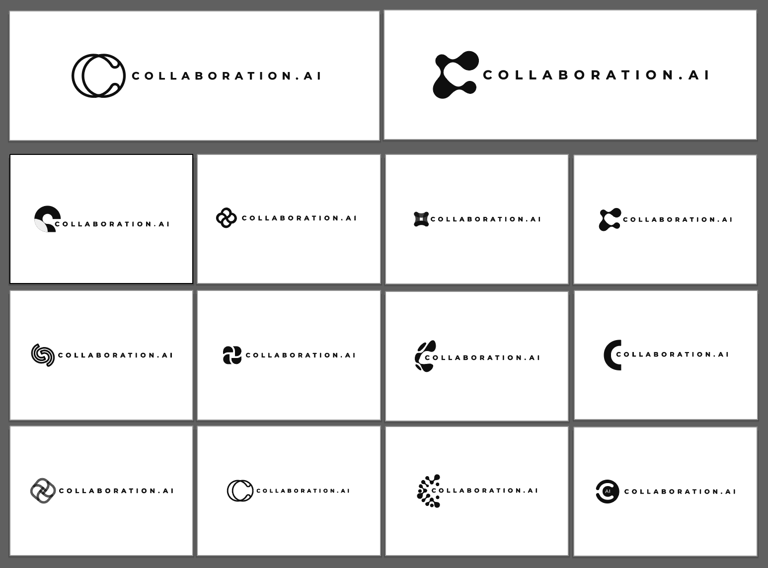
The design process began with an intensive exploration phase, producing multiple logo studies that initially leaned heavily into a tech-centric approach.
The first two rounds of concept presentation focused primarily on letterform solutions that veered too far into abstraction leading to ultimately losing sight of the brand’s essence of human connection.

Recognizing the misalignment of idea, I discarded the earlier direction of the study and returned back to the ideation phase with fresh perspective, this time, anchoring the idea to the company’s core and connecting it to the existing brand identity.
By revisiting the brand’s initial elements, I was able to craft a logo that not only echoed its established visual identity, but more importantly, highlighted the idea’s narrative around its core mission of human connection.

.gif)
A simple pictorial mark that symbolizes the linkage of idea, and the never ending potential and capabilities of human connection.
It is inspired from the infinity loop and from the “idea” icon of Collaboration.AI’s existing brand identity elements.

.gif)
The color palette of the symbol is a product-agnostic approach to represent the four products of Collaboration.AI as a whole. It is characterized by Yellow to create differentiation from the other respective product colors.
The color inspires communication, signifies growth, energy, and motion.
.gif)


The logo is designed to embody the concept of linkage of ideas and the never-ending potential and capabilities of human network connection.
Collaboration.Ai’s connection symbol is intentionally kept simple yet impactful to ensure easy memorability and recognizability. The color palette is a product-agnostic approach to create differentiation as the brand from the different product softwares that the company offers.